Talking colour with Alex Fulton
When we decided to write a post on colour we knew exactly who to call in for help…
Interior designer and ‘rebel with a colour wheel,’ Alex Fulton, answers our quick-fire questions about how to use colour in interiors and “design like no-one is watching.”
You’re known for your love of vibrant colour, have you always been like this or has your style and colour confidence evolved? If so, do you have any tips for those who are used to decorating with white walls and are afraid to try?
Since a very early age I liked to surround myself with colour. I was always ‘changing’ my room around, redecorating and curious about colour. The colour interest was also evident in what I wore which is also still true today. I just feel better when I’m around colour, when I wear colour and when colour is present in my world.
I have made a career around this love and it influences me both personally and professionally. There is a distinct thrill I get from mixing and matching colours which is my most favourite part of colour and designing with colour. My best tip is to use colours that you love. If you love white, then use white.
There are many creative and clever ways to incorporate your faves into your interior schemes in ways that suit who you live with and how you live. I try to encourage people to “design like no-one is watching.” It’s a rule I live by and would love to spread to others. By this I mean that we often design because it’s ‘on-trend’ or the neighbours have done it. Taking the time to find what you love and to then surround yourself with those elements you love may take a little more effort but it will give you the greatest of joy!
Do you have a favourite colour combo?
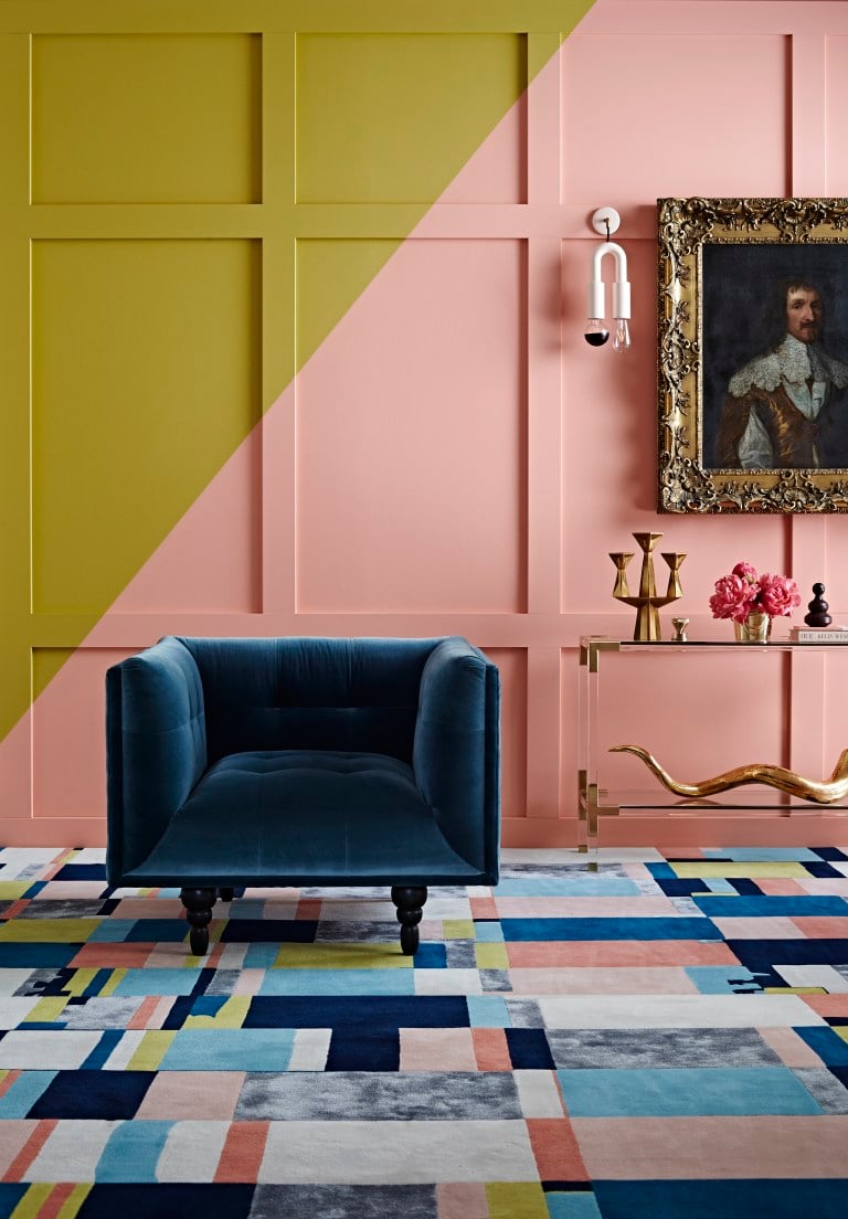
I’m so glad you asked this and not ‘what is your favourite colour’! As I said it’s colour combinations that spin my wheels. I’m like a sniffer dog always on the hunt for new variations and ways to put colours to together. The more unexpected the better. I’m coming off a mid-blue, mustard, pale pink and red combination that has recently been featured in my magazine styling and my online shop set design. The hero of these designs have been a large art piece called ‘Ode to Norm’ that uses all these colours in organic forms.
What’s next? I’m thinking green (still deciding between forest, olive or mint) burgundy, peach and bright yellow…Yum.
Colours can go in and out of fashion, can you tell us what colours are “on trend” at the moment?
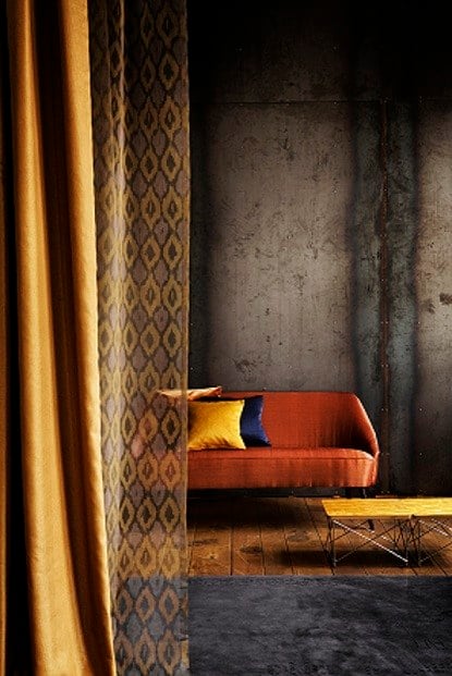
Even though I’m not a fan of the term ‘trend’, colour and colour combinations are most definitely cyclic. A year ago there was not a sign of red in my store and now orange and blue based reds are popping up in this seasons homewares.
Actually it’s more than the red hue it’s red WITH light pink that seems to be coming through strongly. Mustards are also hot property with good old black and white never far away.
Shall I make a prediction here? Ok, why not. I think greens are going to be in the next year’s forecast. Greens in mid the mid to dark colour range and matching with saturated brights (see my next online collection at afdstore.co.nz for an AFD version!)
Lots of people talk about colour ‘rules’ i.e. stick to 3 colours at the most – do you go by any of your own colour rules? If so, what are they?
Rules, schmules.
My advice to my clients is to create a collection of images whether it’s online using a platform like Pinterest or good ol’ fashion ripping pages out from interior magazines. Collating inspiration can give you some very helpful clues into your design style and colour direction.
You might notice a common theme i.e. white wooden floors, dark navy joinery large doses of plants and tongue and groove walls. Bingo – a colour and design theme seed has started to sprout. Keep developing that and grow your final ideas to reflect what lights your fire. That’s YOUR fire and not anyone else’s…